Learn CSS colors by building a set of colored markers
Objective
To learn different ways to set color values and how to pair colors with each other.
<!-- file: index.html -->
<!DOCTYPE html>
<html>
<head>
<title>Colored Markers</title>
<meta charset="utf-8"> <!-- utf-8 is a universal character set that includes almost every character from all human languages. -->
<meta name="viewport" content="width=device-width, initial-scale=1.0"> <!-- enables the page to look the same on all devices-->
<link rel="stylesheet" href="styles.css">
</head>
<body>
<h1>CSS Color Markers</h1>
<div class="container">
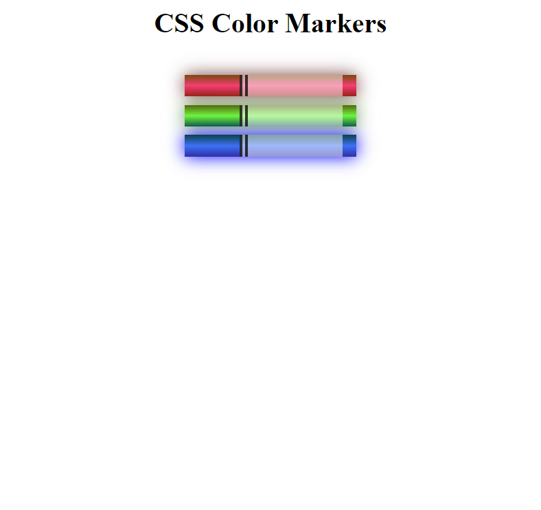
<div class="marker red">
<div class="sleeve"></div>
<div class="cap"></div>
</div>
<div class="marker green">
<div class="sleeve"></div>
<div class="cap"></div>
</div>
<div class="marker blue">
<div class="sleeve"></div>
<div class="cap"></div>
</div>
</div>
</body>
</html>
/* file: styles.css */

h1 {
    text-align: center;
}

/* class */
.marker {
    /* background-color: red; */
    width: 200px;
    height: 25px;

    /* shorthand margin property has two values:
    - margin-top and margin-bottom to the first value
    - margin-left and margin-right to the second value */
    margin: 10px auto;
}

.red {
    /* background-color: rgb(255, 0, 0); */
    background: linear-gradient(90deg, rgb(255, 0, 0) 75%, rgb(0, 255, 0));    /* creates red-green gradient */
    box-shadow: 0 0 20px 0 rgba(83, 14, 14, 0.8);
}
.green {
    /* background-color: #00FF00; */
    background: linear-gradient(180deg, #55680D, #71F53E, #116C31);
    box-shadow: 0 0 20px 0 #3B7E20CC;
}
.blue {
    /* background-color: hsl(240, 100%, 50%); */
    background: linear-gradient(hsl(186, 76%, 16%), hsl(223, 90%, 60%), hsl(240, 56%, 42%));
    box-shadow: 0 0 20px 0 hsla(223, 59%, 31%, 0.8);
}

.container {
    background-color: rgb(255, 255, 255);
    padding: 10px 0;
}

.sleeve {
  width: 110px;
  height: 25px;
  background-color: rgba(255, 255, 255, 0.5);
  /* opacity: 0.5; */
  /* border-left-width: 10px;
  border-left-style: solid;
  border-left-color: black; */
  border-left: 10px solid rgba(0, 0, 0, 0.75);    /* width style color */
}

.cap {
  width: 60px;
  height: 25px;
}

.cap, .sleeve {
    display: inline-block;
}
Color models
- additive RGB (red, green, blue) model used in electronic devices. (additive means that colors begin as black and change as different levels of red, gree, and blue are introduced.)
- subtractive CMYK (cyan, magenta, yellow, black) model used in print.
- HSL (hue, saturation, lightness) accepts 3 values:
- a number from 0 to 360 for hue
- a percentage from 0 to 100 for saturation
- a percentage from 0 to 100 for lightness
primary colors: colors that, when combined, create pure white.
secondary colors: colors you get when you combine primary colors. They are:
yellow= red + greencyan= green + bluemagenta= red + blue
tertiary colors: created by combining a primary with a nearby secondary color. They are:
orange= red + yellow = 2*red + green = rgb(255, 127, 0)spring green= cyan + green = 2*green + blue = rgb(0, 255, 127)violet= magenta + blue = red + 2*blue = rgb(127, 0, 255)- … and more.
Functions used
rgb(red, green, blue): each argument is a number from 0 to 255.hsl(hue, saturation, lightness).linear-gradient(gradient direction, color1, color2, ...): used for color transition. It actually creates animageelement and is usually paired with thebackgroundproperty which can accept an image as a value.
It needs at least two color arguments to work.
Default value forgradient directionargument: 180deg (from top to bottom).rgba(redValue, greenValue, blueValue, alphaValue): alphaValue is extent of opacity from 0 to 1.0
Property
box-shadow: offsetX offsetY blurRadius spreadRadius color;
Leave a comment