Learn CSS box model and Flexbox by building a photo gallery
Learn the CSS box model
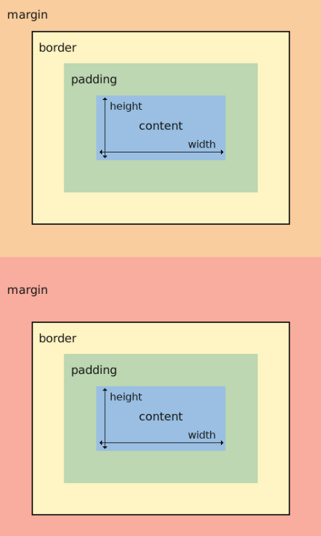
In the CSS box model, every HTML element is treated as a box with four areas.
shorthand properties
padding: adjust the spacing within an element (between content and border).
margin: top horizontal bottom;
-> adjust the spacing outside of an element (outside border).
-> can be used to control the space between other boxes or elements.
filter: blur(2px);
-> blur the element by 2px.
border-radius: top-left top-right bottom-right bottom-left;
-> round each corner of the element in pixels.
transform: rotate(-0.6deg);
-> rotate counterclockwise by 0.6 degrees.
Learn CSS Flexbox by building a photo gallery
Flexbox helps you design webpage so that it looks good on any screen size.
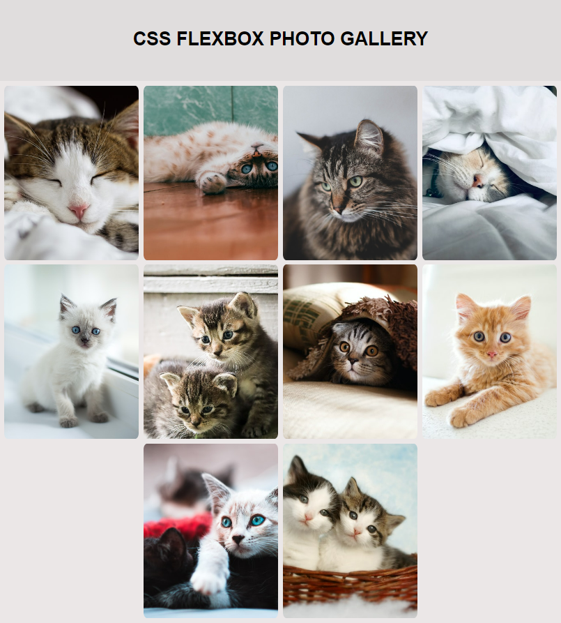
Objective: use Flexbox to build a responsive photo gallery webpage.
<!-- file: index.html -->

<!DOCTYPE html>
<html>
  <head>
    <meta charset="utf-8">
    <meta name="viewport" content="width=device-width, initial-scale=1.0">
    <title>Photo Gallery</title>
    <link rel="stylesheet" href="./styles.css">
  </head>
  <body>
    <div class="header">
      <h1>CSS FLEXBOX PHOTO GALLERY</h1>
    </div>
    <div id="gallery">
      <img src="https://cdn.freecodecamp.org/curriculum/css-photo-gallery/1.jpg"/>
      <img src="https://cdn.freecodecamp.org/curriculum/css-photo-gallery/2.jpg"/>
      <img src="https://cdn.freecodecamp.org/curriculum/css-photo-gallery/3.jpg"/>
      <img src="https://cdn.freecodecamp.org/curriculum/css-photo-gallery/4.jpg"/>
      <img src="https://cdn.freecodecamp.org/curriculum/css-photo-gallery/5.jpg"/>
      <img src="https://cdn.freecodecamp.org/curriculum/css-photo-gallery/6.jpg"/>
      <img src="https://cdn.freecodecamp.org/curriculum/css-photo-gallery/7.jpg"/>
      <img src="https://cdn.freecodecamp.org/curriculum/css-photo-gallery/8.jpg"/>
      <img src="https://cdn.freecodecamp.org/curriculum/css-photo-gallery/9.jpg"/>
      <img src="https://cdn.freecodecamp.org/curriculum/css-photo-gallery/10.jpg"/>
    </div>
  </body>
</html>
/* file: styles.css */
* {
box-sizing: border-box;
}
body {
margin: 0;
font-family: Arial;
background: #EBE7E7;
}
.header {
text-align: center;
padding: 32px;
background: #E0DDDD;
}
#gallery img {
width: 25%; /* 4 images fit horizontally */
height: 300px;
object-fit: cover; /* tell the image to fill the img container while maintaining aspect ratio, resulting in cropping to fit. */
margin-top: 8px;
padding: 0 4px;
border-radius: 10px;
}
#gallery {
display: flex; /* enable this #gallery element to use Flexbox */
flex-direction: row;
flex-wrap: wrap;
justify-content: center;
align-items: center; /* since flex-direction is set to row, cross axis is vertical. Therefore this property vertically centers the images. */
}
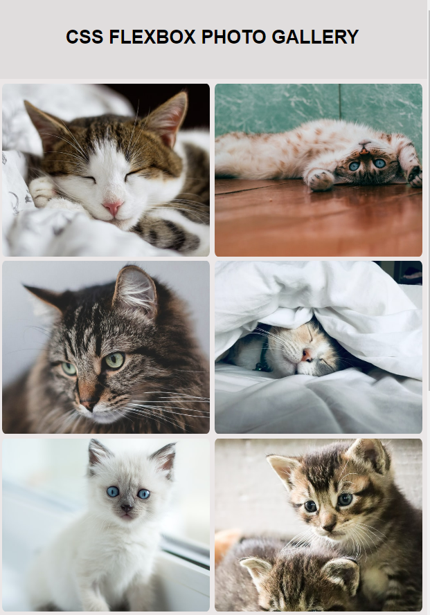
@media (max-width: 800px) {
#gallery img {
width: 50%; /* only applied to screens with width smaller than 800px. Gives two-column layout. */
}
}
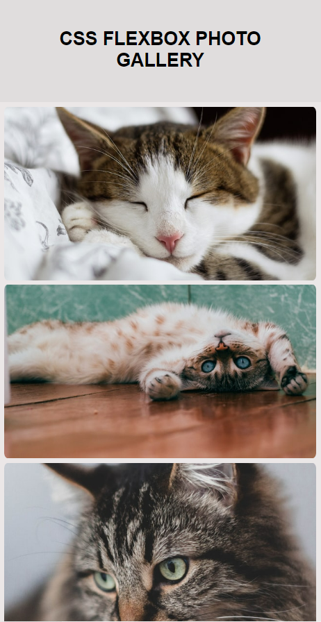
@media (max-width: 600px) {
#gallery img {
width: 100%; /* Gives single-column layout for screens with width smaller than 600px. */
}
}
Flexbox
Flexbox is a 1-D CSS layout approach that focuses on the flow of content.
It can be thought of having two axes:
- main axis: It is determined by the
flex-directionproperty.
ifflex-direction: row/row-reverse -> horizontal main axis.
ifflex-direction: column/column-reverse -> vertical main axis. - cross axis.
flex-wrap property determines how your items should behave when the flex container is too small.
flex-wrap: wrap; -> allow items to wrap to the next row/column.flex-wrap: nowrap; -> prevent items from wrapping. Items may either shrink to fit or overflow.
justify-content property: determines how the items inside a flex container are positioned along the main axis.
align-items property: positions the flex content along the cross axis.
object-fit property: helps to determine how images should behave.
Media Query
미디어 쿼리는 반응형 웹디자인의 기본이다. CSS에서 어떤 스타일을 선택적으로 적용하고 싶을 때 사용된다. if 조건문과 비슷한 개념이라고 생각할 수 있다.
/* 문법 구조 */

@media (조건) {
    스타일
}
맨 위에 CSS에 두 개의 다른 media query를 설정해 줌으로써 화면 크기에 따라 다른 레이아웃을 보인다.
Leave a comment